
How we use font colors to help beginning readers
Beginning readers frequently have trouble when single sounds are written with multiple letters, like "sh", "th", or "ay”.
When it takes multiple letters to write one sound, they're called digraphs, and they make reading much more complicated. Now when I see a letter, I can’t just read each letter individually like in “s...i...p”. In the word “ship”, for example, I have to look ahead to the following letter to figure out what sound my current letter is going to make!
Some teaching methods solve this by physically connecting the letters together. This works great for certain letter combinations, like “ch” or “ng”.

But sometimes letters just change their sound, like the “a” in “cake”. So those same methods introduce diacritic marks like a line above the letter. But that same letter can change their sound in multiple ways, like in “car”, so they end up differentiating with a line below the letter instead. Or sometimes a line above and below the letter, and sometimes changing the letter size entirely.
And before you know it you’re teaching an entirely new system of written symbols, and ultimately, you’re not teaching the correct skill, which is the ability to see a word and parse it into the phonetic elements that it’s composed of.

In order to avoid all that complexity and confusion, we put training wheels on that situation by using a different font color for newly learned phonetic elements. Those phonetic elements then contrast strongly with the rest of the word, so the student immediately knows this is not t-hat, but rather that the t and h work together to represent a different sound.
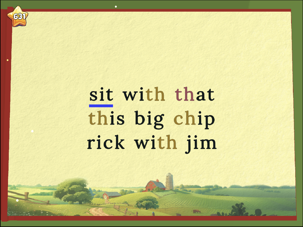
As the student gets better at recognizing each phonetic element, we take the training wheels off a bit, and reduce the contrast between the element and the rest of the word. In this image you can see that the dark green of “er” only slightly contrasts with the rest of the word, and the “or” is just subtle greyscale difference. The “th” got this color treatment in early levels, but now that the student can recognize it consistently, it’s just rendered in black.

This feature has been a gamechanger in playtesting. It significantly improves kids’ ability to recognize and parse letter combinations, and allows us to gradually reduce that support as kids become more capable.
I’m excited bc this is our first feature that doesn’t just replicate existing teaching practices, but actually improves on them in ways that would be impossible without software